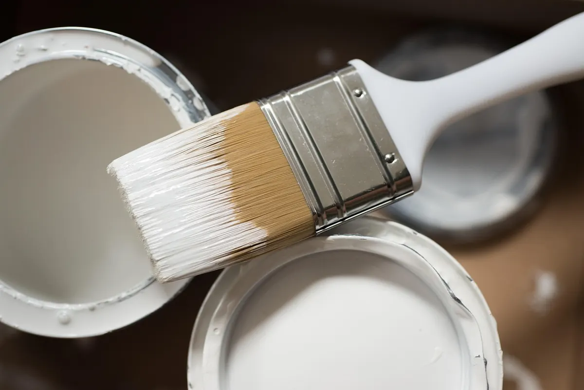
Stand in front of a paint display and the whites multiply: chalk, cotton, linen, shell, snow. Under the strip lights they look almost identical. Get them home and one turns creamy while the other goes faintly blue. White is not a colour so much as a family, and the one that looks perfect in a bright kitchen will often look wrong in a north-facing spare room.
What follows is how whites are built, how your light changes them, and which finish belongs where. Get these three things straight and you will choose well the first time.
Every white has an undertone
Almost no wall paint is pure titanium white straight from the tin. Manufacturers add tiny amounts of other pigments to soften it, and that trace of colour — the undertone — is what your eye actually reads once the paint is on the wall. Whites fall into three broad camps.
Warm whites
These carry a hint of yellow, red, pink or cream. They feel soft and traditional, and they are the forgiving choice for rooms that never get direct sun. In a dark hallway or a north-facing bedroom, a warm white lifts the gloom without turning yellow. Put one in a very bright, south-facing room, though, and it can start to look slightly dingy next to crisp white woodwork. They also sit happily with oak floors, terracotta tiles and warm-toned fabrics.
Cool whites
Blue, green, grey or violet undertones give a clean, modern feel. They shine in south-facing rooms, in kitchens with lots of daylight, and against grey or dark floors. The catch is cold light: in a north-facing room or a shaded corner, a cool white can tip into grey-blue and make the space feel chilly from October to March. If you love the crispness but the room is dim, pair it with warm bulbs and warm wood rather than more grey.
Bright whites
Bright whites have very little undertone at all, sometimes with a touch of black to keep them neutral. They read as "true" white and are excellent on ceilings and woodwork, where you want a clean edge. On large walls they need help. Without decent light or strong contrast — dark floors, dark furniture, a bold rug — a bright white can feel stark and slightly clinical. Use it deliberately as a contrast, not as a default for every surface.
Light decides more than the paint chart
The same tin will look different in every room of your house, because daylight has a colour of its own. As a rough guide:
- North-facing: cool, even, slightly blue-grey light all day. Warm whites and soft off-whites hold their warmth here.
- South-facing: strong, warm light for most of the day. Cool whites stay crisp; warm whites can drift yellow by late afternoon.
- East-facing: warm sun in the morning, cooler and flatter after lunch. A slightly warm white is the safest bet.
- West-facing: dim mornings, golden light in the evening. Warm whites glow beautifully; cool whites can look grey until the sun arrives.
Two other things matter as much as the compass. The first is your lighting after dark: a warm bulb will flatter a warm white and muddy a cool one, while cooler bulbs make warm whites look yellow. If you mostly use a room in the evening, judge your samples under your own lamps as well as in daylight. The second is bounce. Dark floors and dark furniture absorb light and make walls read darker and greyer, while a white wall next to a strong colour will pick up a cast of it. Pale walls in a room full of pale furniture can also blur into one another, which is where a brighter white on the woodwork earns its place.
Finish changes the colour too
Sheen affects how much light a surface throws back, so the same white can look noticeably different in matt and in eggshell. Matt absorbs light and hides lumps, bumps and patchy plaster, but it marks more easily and is harder to wipe clean. The higher the sheen, the more durable and wipeable the surface — and the more it shows every imperfection underneath.
- Ceilings: matt or flat, usually in a bright or cool white to bounce light around the room.
- Living rooms and bedrooms: matt or washable matt on the walls, where you want softness rather than shine.
- Hallways, kitchens and children's rooms: eggshell on the walls, because it takes knocks and can be sponged down.
- Skirting, doors and window frames: eggshell or satin for durability. Gloss is the toughest and easiest to clean, but it highlights every dent in the wood, so it needs good preparation.
- Bathrooms and kitchens: a moisture-resistant finish, and expect a higher sheen to make a small room feel brighter.
One practical note: if you use a matt white on the ceiling and the same shade in eggshell on the walls, they will look like two different whites. That is often fine — it reads as deliberate contrast — but if you want a seamless effect, keep the sheen consistent or accept the difference knowingly.
How to test before you commit
Samples on a paint chart tell you very little. Do this instead:
- Narrow your choice to three whites. Any more and you will tie yourself in knots.
- Buy tester pots and paint patches roughly A4 size directly onto the wall, in two coats, so the old colour does not show through.
- Put a patch on at least two walls — one in the brightest spot, one in the darkest corner.
- Leave them for a full day and look at them in the morning, at midday and at night with the lights on.
- Hold a sheet of plain white paper beside each patch. The undertone will suddenly be obvious.
- Check the patches against your floor, your sofa and your existing woodwork. A white that looks lovely on its own can fight a warm oak floor or a grey carpet.
Label each patch with masking tape and keep the tester pots until the job is done. When you buy the full tins, get them all at once and check the batch codes match, because whites can vary slightly between batches — and keep a small amount back for touching up scuffs later.
A simple way to decide
Work through three questions in order. First, what is the light like? A north-facing or dim room wants a warm white; a bright, sunny room can take a cool or bright one. Second, what mood do you want? Soft and cocooning points to warm; sharp and modern points to cool or bright, especially with dark floors. Third, what is the surface? Ceilings and low-traffic walls can be matt; anything that gets touched, splashed or scuffed needs eggshell or satin.
If you are repainting a rented property, check your tenancy agreement before you start, as some require you to return walls to their original colour. And if you are dealing with damp patches, flaking plaster or suspect old paint in an older house, sort the underlying problem first — a fresh coat of white will not fix it, and it is worth taking proper advice before you paint over it.
Get the undertone and the finish right and white stops being the safe, boring option. It becomes the thing that makes a room feel bright at nine in the morning and warm at nine at night.
Photo: ClickerHappy / Pixabay